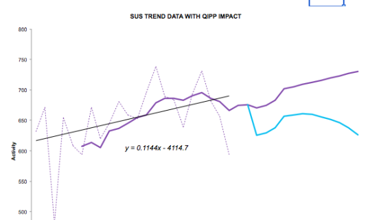
Excel offers the option to insert a series of trendlines on your charts.
I have been using the linear trendline feature to represent the historic trends in SUS activity data and I wanted to use the associated formula to generate forecast data based on this trendline.
If you think back to your algebra days you may remember that a straight line can be expressed as y=mx+c
Where m= the gradient and c is the intercept or where the line crosses the y axis
You could simply use the option to show the equation on the chart and extract the values of m and c, or you can use two functions to deliver the relevant values.
The benefit of using the functions is that you can change the data and the values of m and c will update automatically.
For the straight line trendline, the relevant formulas are
m = SLOPE(y,x) c = INTERCEPT (y,x)
where y is the range of activity data values and x is a range of dates
I’ve used this concept to prepare a very simple forecast model showing the historic SUS trend data, the forecast SUS activity data (based on the trendline equation) and then overlaid the planned impact of QIPP. Because the forecast is now formula based you can use the dropdown to flick between different PODs, either NEL, A&E or OP and the forecast will adjust based on the revised y=mx+c formula.
The example forecast model is attached and could be easily amended to improve the forecast, perhaps by adding seasonality to the underlying trend. Forecasting using linear trend equations and dates.xls
If you want to use more complicated trendlines, you can still use functions to extract the relevant parameters.
J-Walk lists out more trendline formulas than I knew existed.
Chandoo has created a really useful page on trendlines and forecasting as well.
I’ve recently posted a followup to this post with a revamped growth model that enables you to dermine the annualised growth rate for the liner trend line - very handy!

