I recently wrote a post on the excelpivots site showing how you can use pivot tables to compare data without resorting to the inferior VLOOKUP method.
I thought I’d expand on that technique here with a few NHS examples that show how I often use pivot table comparisons to check my own work.
So to very quickly recap.
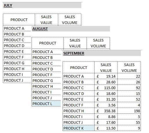
In the example given on the excelpivot site, I had 3 files with sales data for 3 different months and my challenge was to compare them month by month.
The pivot table comparison method requires you to:
- stack the data sources on top of one another with the header left at the top only
- make sure the structure is the same or adjust if necessary eg if a new column appear in one month you’ll need to insert blank columns in the missing months.
- add a new column that represents the difference between each data source eg month or date. I usually call this field Source
- ensure the header fields are complete - no blanks or the pivot wizard will give you an error message
- create a pivot table using the new Source column as the field header
In an NHS environment I am much less interested in sales but I use this method all the time. For example:
Flex-freeze comparisons
In my current role I report on the income for a large trust. Determining what the financial impact is going to be of moving from a partially coded flex position to a fully coded freeze position is an ongoing challenge.
Understanding the historic flex-freeze movements is useful and to do this I use a pivot table comparison report.
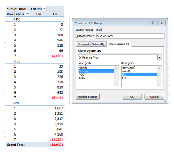
My source data may have multiple columns such as POD, Specialty, HRG and activity and value but the key field is my new Source column which indicated whether the data is flex or freeze.
When I drop this into the field header area of the pivot it’s very easy to see the movements.
Here’s the trend
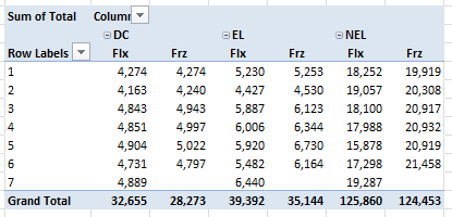
And again with Difference From option used to show Freeze movements.
Before and After comparisons with Pivot Tables
I use the generic before and after method all the time to check my work.
For example, I start with an activity and finance plan that I need to make some change to.
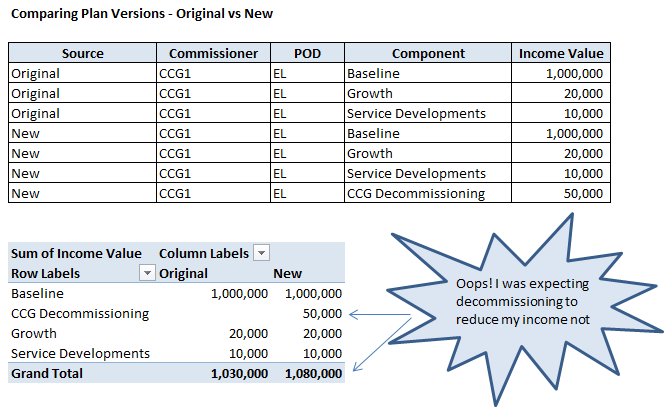
Let’s say I need to reduce the plan to reflect a commissioners decommissioning plans. I do my working and am totally convinced that I’ve got everything present and correct.
I could apply my adjustments and walk away or if I want to sleep soundly at night, I could check my work with a before and after comparison.
In that case I would stack the original plan data and create a new Source column populated with the word “Original”. Then I would append at the bottom, my corrected data which I will then call something imaginative like “New”.
Pivoting this data stack with Source in the field header will again put the two plans side by side. At that point I can see fairly easily if my intended adjustment had worked as planned.