Waterfall charts have almost reached cult status in the office recently. They are popping up all over. We are well into the new years planning process and a waterfall chart is the perfect way to demonstrate how a starting position either increases or decreases through a series of changes.
So in our case, when planning for next year’s acute healthcare budget, we may start with the forecast outturn for the current year, throw our hands up in despair and then work through a series of savings initiatives or QIPP’s that are designed to bring us back to a position of affordability.

This can be easily demonstrated by the use of a simple waterfall chart which is a version of a stacked bar chart with some elements formatted so that they are not visible.
Here you can see the driving table and the series clearly visible before formatting.

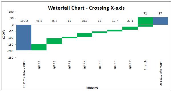
Life in the waterfall chart world becomes a little more difficult if your movements are going to take you either above or below the x-axis.
You can imagine this happening if instead of starting with forecast outturn we model the affect on the planned deficit/surplas. The chart below shows the starting position before QIPP or savings programs and the incremental affect of appyling each projected saving.

The table required to generate this chart is quite complex but it does at least illustrate the position accurately if the data crosses the x-axis. The simple model shown above would display the data incorrectly.

You can download the spreadsheet I used to draw up these examples which will show all the relevant formulas WaterfallChart.xlsx but I would also recommend that you take a look at the excellent Peltier website which explains the creation of both simple and complex waterfall charts in more detail and describes the formatting process step by step - I used this site to learn the techniques.