Today I am processing data from a patient level costing system (PLiCS) and trying to assess the cost distribution by the patients diagnosis.
Frequency distribution charts can be a bit painful to produce in excel so I have fallen back on my favourite tool – the pivot table which enables me to produce dynamic excel histogram charts within minutes.
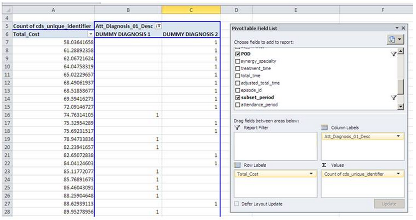
You start with your dataset showing as a minimum, the unique patient episode identifiers, diagnosis codes and the cost per episode. Pivot this table with cost in the row area (not data) and then the unique patient episode identifiers in the data area. As I’m interested in how many episodes fell into each cost bin I have used the COUNT function on cds_unique_identifier.
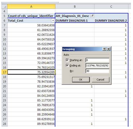
Now to get the cost buckets or bins, you right click in any of the rows showing Total_Cost and select group. The values in the dialog box are pre-populated but you can overwrite and I have chosen to set my intervals every £30.
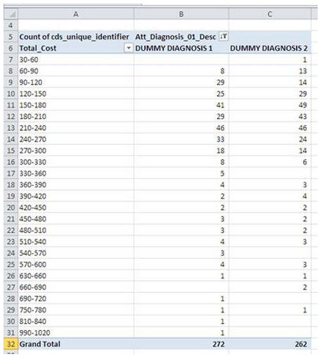
This provides the summarised output table which can then be used to drive a pivot chart – just click in the pivot table then go to the INSERT tab and select the line chart of your choice.
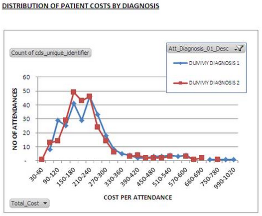
Hey presto – a distribution chart that can be altered dynamically by using the filter to bring in more or less diagnoses.
Now I just need to fathom out what to do with the information.