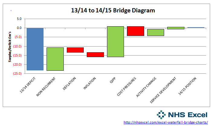
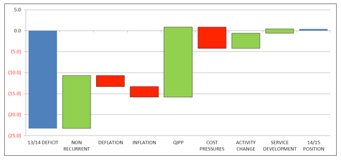
It’s Operating Plan time at work again, and that means long term financial models and bridge diagrams to show the causes of movement between years. I’ve previosuly written about Excel waterfall charts and I had to refer to my own waterfall chart tutorial to help me with this months submission. I’ve been researching the topic further though and have found a really intuitive way to produce waterfall charts or bridge diagrams by using the Up-Down charting feature in Excel.
I think its easier to understand than the stacked bar chart method so I’ve created a quick video to explain the method of creating a waterfall chart in Excel using Up-Down charts.
https://www.youtube.com/watch?v=Oh_8Ow_–UA
If you’ve watched the video and would like to play around with the workbook I’m using you can download it here:
Excel template for a waterfall chart or bridge diagram using up-down chart.
Setting up the Waterfall Chart
Here’s the step by step instructions for building a waterfall chart using the Up/Down bars and is heavily influenced by Peltier and his cutting edge charting blog.
Setting up the Data Table
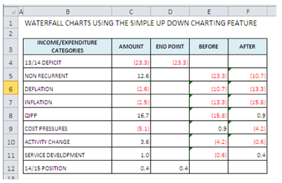
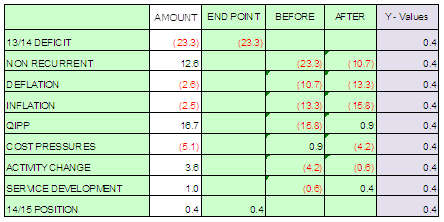
Here’s the data used to formulate the really easy waterfall chart.
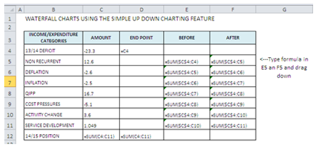
Columns D:F hold the formulas.
Type them as written in cells D4, D12, E5 and F5. You can then drag the formulas down in columns E and F. Be very careful to follow the absolute referencing in the formulas (ie the placement of the $ sign).
- D4
=C4 - E5
=SUM($C$4:c4) F5 =SUM($C$4:C5) D12 =SUM(C4:C11)
Insert the initial chart
Select the data B3:C12 and then press CTRL and highlight D3:F12 as well. Insert – Line Chart 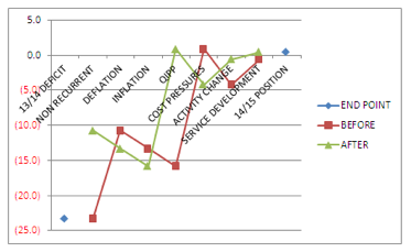
Right click over the x-axis and select format axis so you can move the data labels to the low position and get them out of the way of the data. You now have 3 series on the chart:
- End Point
- Before
- After
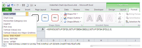
Highlight the End Point series and convert to a bar chart. You should be able to select the series by clicking on the data points but if you ever struggle (perhaps because you’ve formatted the series to make it invisible) you can select the series by going to Chart Tools (on the ribbon), selecting Format and then over on the left using the drop down to select the series of choice.
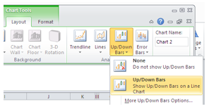 Now select either one of the remaining line chart series: Before or After and then you will need to turn on the Up/Down bars for this series. Go to the Chart Tools area of the ribbon, select Layout - Up/Down Bars and then select the option to show them.
Formatting the Waterfall Chart
Now that the Up Down bars are in place you can see the expected form of the waterfall chart building up nicely. From here on in, it is just a series of formatting steps to prepare the final waterfall chart.
- Select and format both the Before and After line series so that Marker Options are set to none and Line Colour is set to No Line (note in the video I actually clicked solid line by mistake and flummaxed myself – make sure you select no line)
- Right click on one of the Up Bars (currently white) and format to an appropriate colour. If it’s a favourable movement I go fro green and use red for advers.
- Right click on one of the Down Bars and format that with a different colout
- Right click on the legend and click delete as this has no informational benefit
- If you would like to narrow the gap between the bars you need to do this in two stages:
- Right click on the End Point column, format series and move gap width to around 20%
- In order to adjust the gap between the Up/Down Bars you need to select either the Before or After series and not one of the actual bars. Either use the trick mentioned above to select the series or click madly on the chart until you find it. Right click, format data series and adjust the gap width to 20%
This then takes us to the point where the video finished with a waterfall charts that just requires a title and the axes labelling.
If you would like to add data labels to show the movement above each column, you will need to follow these additional steps to add a new series as you can’t directly label Up/Down Bars.
Adding Data Labels to Your Waterfall Charts
The easiest way to add data labels is to create an invisible series that holds the values you require.
I created a new column called Y Values and set the values to be equal to the Max of the End Point column which means that I can display all the value on the same level, preferably above all my columns.
So in the example spreadsheet the value would be 0.4.
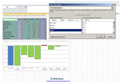
Add a new series to your chart with the Series data looking at your new column (Y Values) and the x axis data pointing at the values you want to use for your label, which in this instance is the Amount column.
In excel 2010 the way to do this is to go to the Design tab and choose the Select Data option. From this box you now add a new series called Labels. The Series Values are G4:G12 in my example (all the 0.4 values) and the Axis Labels are C4:C12 (the Amount values).
Once you’ve added this new series the waterfall chart looks a bit odd but don’t worry, it just needs a bit of formatting.
You should now have a straight line on your chart (which may or may not be visible), you need to select this series and format it so that it is displayed on the secondary axis (you can delete this later but you don’t want it interfering with the Up Down series).
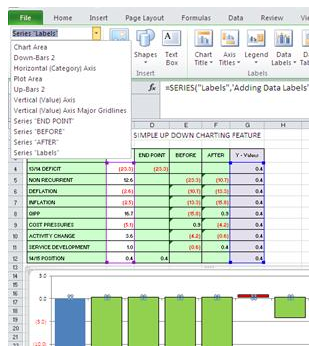
In order to select the Series in Excel 2010 go to the Layout tab and on the left hand side of the ribbon use the dropdown box to select Series “Labels”. You should notice some butterfly selection indicators, right click on one of these and select Format Data Series, I ensure that a solid line is chosen initially, although I will remove it later. You should also select the option to show this series on the Secondary Axis as this gives you easy control over the placement of the labels.
Next you can add the data labels – select the series again (use the drop down box for ease), right click and choose Add Data Labels. Now format these data labels and select the option to show category name (ie the x-axis value rather than the value).
Finally, format the series so that the line and markers are not visible and then format the secondary axis so it is no longer visible.

