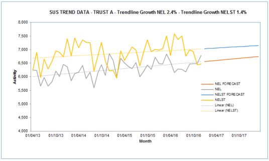
In this post I’ll demonstrate how to generate annual growth rates based on historic linear trends. It effectively adds the % annual growth rate to a linear trendline produced on an excel chart.
I’ve previously published a post sharing a model I used to produce linear forecasts from historic activity data, so I could generate year on year growth projections for our 5 year plans. This post extends that and shows both the annual growth for the historic trend and the annual year on year growth. In the short term (1-2 years) the year on year growth can vary quite significantly from the underlying trend but in the longer term it will tend towards the trend.
Typically in planning departments you use the current year on year growth (this year vs last year) to determine the future growth and this can lead to inaccuracy. It seems safer to me, to use longer term historic trends to predict future activity, although this is not fool proof either.
The Annualised growth from linear trend line spreadsheet is available to download and includes 3 example models of increasing complexity:
- Single Trend - a model to plot a single activity trend, in this case Non Elective admissions for an NHS Sector
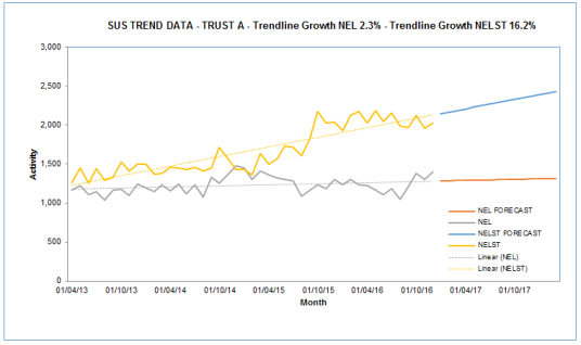
- Double Trend – this enables you to plot two trends, in this case Non Elective (NEL) and Non Elective Short Stay (NELST) admissions – Note that this particular example demonstrates that linear trends are not infallible!
- Four Trends – this is now extended to four trends, in this example showing age group splits (Under and Over 65) for NEL and NELST
The model requires you to enter actual data and it then projects a linear forecast for future months and years. In this case it is pre-populated with dummy activity data from April 2013 to Dec 2016 and provides linear forecasts to the end of 21/22.
If you add your own data with a different date range you will need to amend the forecast formulas so that they point at the correct range.
The chart plots the actual data as well as the forecast and the linear trend.

The outputs of the model are both the underlying linear growth rate (that is the annual growth rate of the trend line) and the year on year growth rates.

You can see that while next year’s growth rate (17/18) for NEL is predicted to be 3.4% the underlying trend is lower at 2.4% and future years predictions will therefore reduce.
The formula for determining the growth is based on the linear regression analysis with the key formulas in this section, which produces the key elements of the y=mx+c formula

The final POWER() formula is in cell C11
I got this formula idea from the ExcelForum.
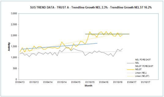
In the spreadsheet I’ve included an example of a specific trust that shows what I would describe as a step change in their activity recording for NELST. This might for example, be related to the opening of an Ambulatory Observation ward that shifts potential 4 hour breaches from A&E into a short term bed. The problem of using a linear trend function when you have a step change, is that you are at risk of massively over estimating future growth trends.

The underlying linear trend for NELST at this trust is calculated at a massive 16.7%

If you look at the trends by eye, you can apply two separate linear trends that are separated by the step change. In this case the most recent trend is actually for a declining NELST trend. You wouldn’t really want to be projecting 16.7% growth for too long!

My model doesn’t correct for this in anyway but you should be review the data you are working with to determine visually whether linear analysis is appropriate.
